In 1987, two Penn State researchers watched people learn to use computers. The same thing happened every time. People jumped right in. The manual sat there, unopened. Nobody got past the basics. Thirty-seven years later? The same problem. Just now with AI.
The two forces at work
Watch a person use a new app. Tap, tap, menu exploration. Typing to get a result, dismissing instructive tooltips, and skipping onboarding tours.
They want the filter applied to their photo. Their presentation looking professional before it goes out. “Learning the app” can wait. The work can’t.
This is the production bias at play. Users focus on the output. Not on mastering the app. They figure out what works and stick to it. Better ways might exist, but they don’t bother looking for them.
Now, look at someone using ChatGPT for the first time.
They type ‘Local WordPress agency for a small site.’ ChatGPT responds with confidence: Avista Digital, 5.0 rating, office photos, detailed services. They click for more. A modal appears with the agency’s philosophy, notable projects, directions, and a call button. Everything looks legitimate.
But where’s the website? Where’s the portfolio? They can call the office, but they can’t verify if those projects are real or made up. It appears to be a Google Business listing. Structured, complete. But there’s no link to check if any of it is true.
That’s the assimilation bias. Humans apply what they know to new systems. The user brought Google expectations to a non-Google system. Search shows real businesses you can verify. ChatGPT generates content about businesses you can’t verify. The familiar interface promised familiar functionality that doesn’t exist.
The assimilation bias gets them started, but keeps them stuck at the basic level of competence. It can also lead them to frustration.
Together, the two biases create the paradox. Users would become more productive and empowered if they took the time to read up on the system. But they won’t. They’ll jump in. Rely on what they know and stick to it.
Why blank fields fail
Open up Excel or Sheets. A ribbon at the top. Cells below. Use a formula. Get the same results every time. Click on a menu today, and see the same options tomorrow. The UI shows what’s possible.
Now launch your favorite AI agent. A blank text field appears. Type a question. An answer appears. Type the same question another time. A different answer appears. You don’t know what changed, or what’s possible. A blank text field reveals nothing. You don’t know how to access more functionality.
Leverage the paradox
The solution isn’t better documentation. Users won’t read it. The solution is to leverage the paradox itself.
Show, don’t tell.
Look at Google’s NotebookLM. As soon as you add a source, specific prompt suggestions appear. Add a link about Starting Strength and get prompt suggestions: “What is the fundamental philosophy and measurable impact of the Starting Strength Method?” “How does Starting Strength compare to other programs?”

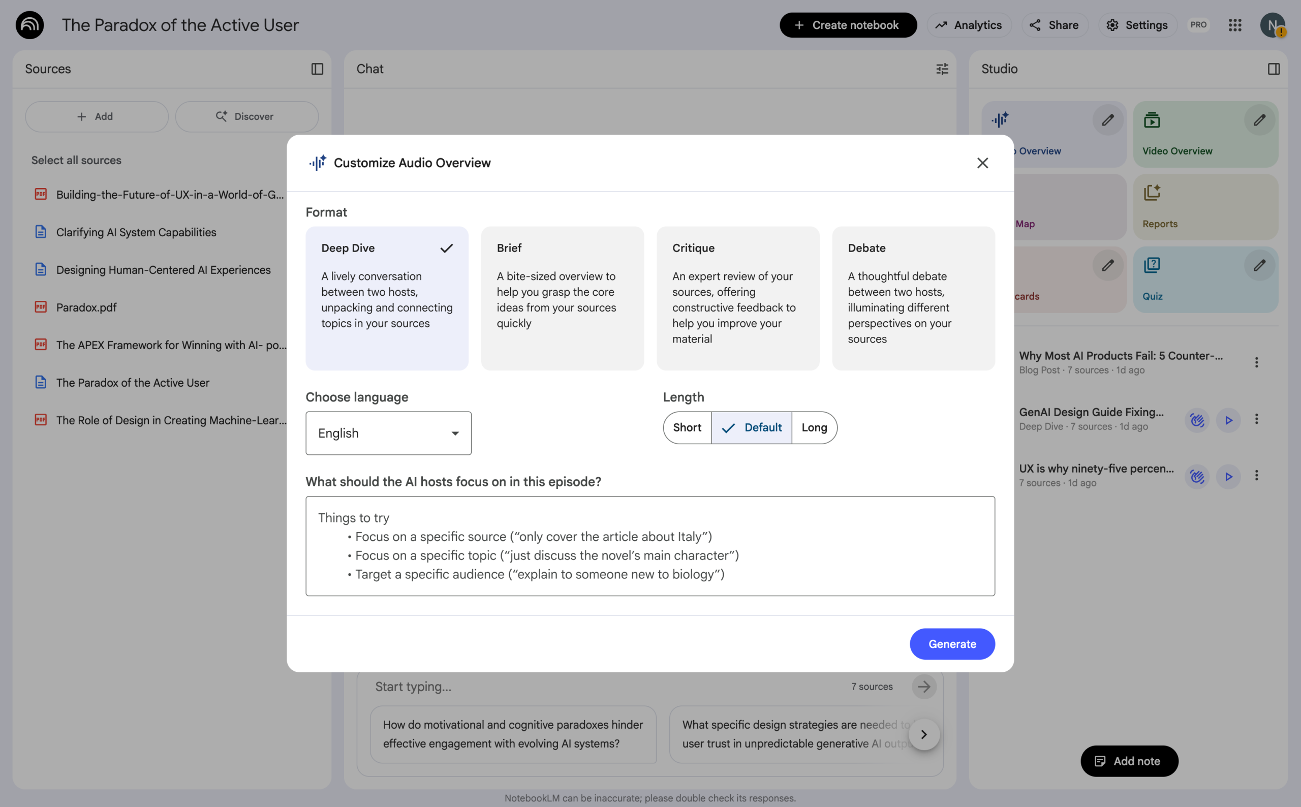
To the right of the prompt UI, additional functionality becomes visible. Generate an audio overview. Click the edit icon to see more options for audio. A deep dive, a brief, a critique, a debate. Each time you select an option, the text field below shows suggestions to enhance the output.
The interface itself becomes the documentation.
Make processing educational
Displaying “Working” is a missed opportunity. Displaying “Searching the web about Starting Strength” and “Comparing sources” reveals that the AI agent can retrieve information online and reason about the best response. Use processing time as teaching moments.
The transition
Most AI products still show blank text fields. But look closer and see UI controls reappearing. Search the web toggles. Style selectors. Suggested prompts. Traditional interface controls are making a comeback because the paradox demands it.
Users won’t learn prompt engineering or best practices for prompting. The production bias will drive them to click buttons and choose from menus.
We’re in transition. Moving from ‘learn to prompt’ toward interfaces that work with human behavior.
The products that embrace this shift, adding UI affordances that users can see and examples they can click, are the ones that everyday users will master.
Good design works with human nature, not against it.
- Bibliography
- Carroll, J. M., & Rosson, M. B. (1987). “Paradox of the active user” – The original research paper from Pennsylvania State University that identified these patterns in how people learn computer systems. Read the paper.
- Laws of UX – A practical overview of the paradox and its implications for interface design.
Read more.
- Cover Image created with Midjourney. Prompt: Concept: Two flowing paths/ribbons that start separately and appear to converge toward the center, but actually loop back to their starting positions representing users who get started but remain stuck at basic competence. Style requirements: Clean, geometric modernist aesthetic Limited color palette: use gradients within each ribbon One ribbon should feel “structured” (maybe blue gradient from light to dark) Other ribbon should feel “organic/AI-like” (maybe orange/pink warm gradient) Include some small black geometric elements (squares or circles) at key points Beige/cream background The ribbons should have depth through gradient shading (like folded paper) Overall composition should be balanced and pleasing
